
Data Visualisation overview
Data visualisation allows you to visualise data contained in an
iSheet
and the status of Tasks
.note
By default, you can have a maximum of 8 panels and 12 KPI cards. To increase this, please contact HighQ support for more information.
This panel allows you to select an iSheet or Tasks from any site in your instance and display the data in a chart or card. Choose from pie charts, column/bar charts, line, area and KPI cards to find the best way to visualise your data.
note
Data visualisation is a premium feature. Contact your account manager for more information.
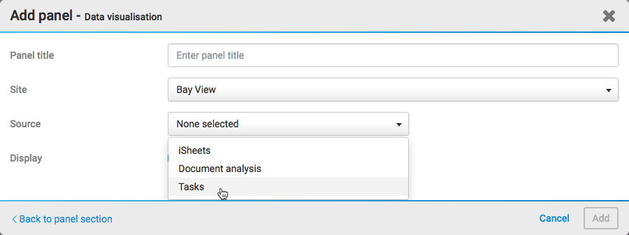
Add a data visualisation panel
Select
Data visualisation
in the Add panel
screen to display the Add panel - Data visualisation
screen.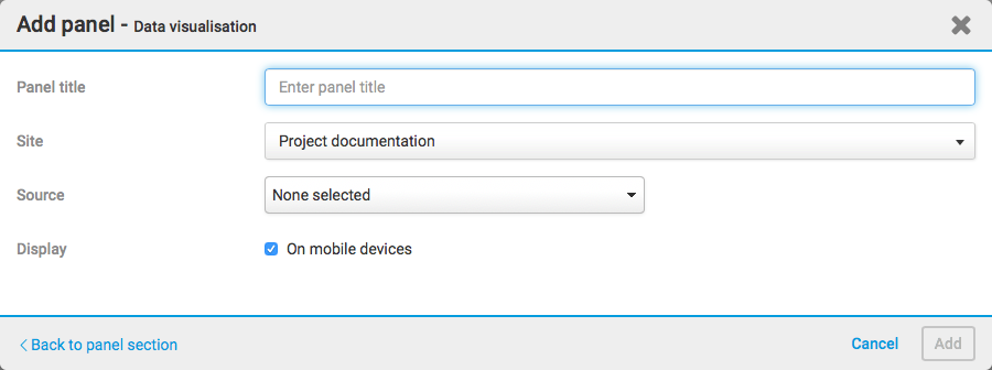
The available fields are described in more detail below:
- Panel title- The name that will be displayed for the panel
- Site- The site from which you will import information
- Source- Select iSheets or Tasks as a source of data
note
If you use a number column in a multi-iSheet source, please ensure that all iSheets have the same number of decimal digits configured in the number column. If different numbers of decimals are used, then the results can be unpredictable. For example, drill-down to the iSheet may not show any results.
- Display- Select if you want this panel to be displayed on a mobile device
Once you have selected your source, additional fields are displayed.
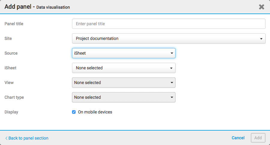
These additional fields are described in more detail below:
- iSheet- Select the iSheet that you are going to import information from.
- View- Select the iSheet view that you are going to import information from.
- Chart type- Select the chart type you want to use to display your information (pie, column, bar, line, area or KPI card).
note
If you select
Tasks
in the Source
field, the iSheet
and View
fields are not shown.Once you have entered all this information, a chart preview is displayed.
note
Please note that to enable Start dates and Due dates in tasks, the 'enable timeline' setting must be set 'on'. If charts are created with this setting on and switched off, then charts based on the start date and due date may become unstable and blank values appear. It is recommended to keep this setting enabled if charts are based on task dates.
Supported column types
Data can be imported from the following column types:
- Single line text
- Choice
- Number
- Date and time
- Lookup (for text, numbers or dates)
- Calculation
And also:
- The File or Task column (to perform a Count calculation, or to use the name as a category; from File and Task Metadata iSheets only)
- Assignee (for KPI charts, from Task Metadata iSheets only)
note
The following columns are not supported: Multiple line text, Score, Hyperlink, Image, Attachment, File link, Folder link, iSheet link, Join, Auto-increment.
As of July 2024, data visualisation supports values from User lookup columns.
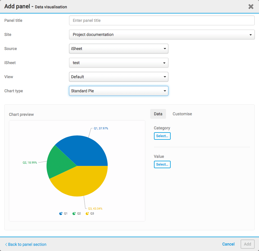
Select a chart
Select the
Category
, Value
, Series
(optional) and Filter
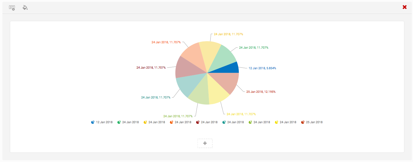
(optional) and you can preview the following charts:Pie charts
- Standard Pie
- Doughnut
- 3D Pie
Column charts
- Standard Column
- Multi-series Column
- Stacked Column
Bar charts
- Standard Bar
- Multi-series Bar
- Stacked Bar
Line charts
- Standard Line
- Multi-series Line
Area charts
- Standard Area
- Multi-series Area
- Stacked Area
KPI
- KPI Card
note
More information about KPI cards is available here.
Once you have selected your category and value, select
Preview
to populate the chart with your data.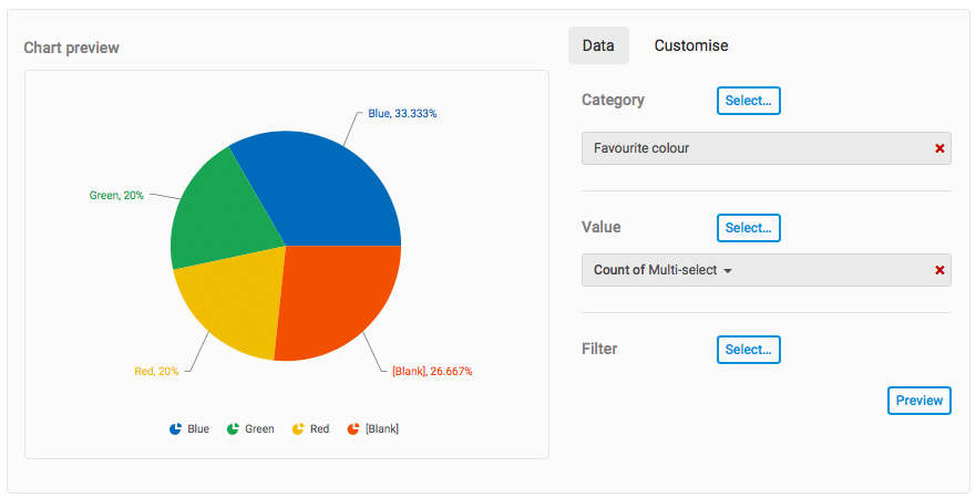
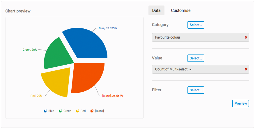
You can select sections of the chart to highlight them. Click and drag to change the orientation of the chart.
note
Further options allow you to include lookup columns within charts.
Filter your data
Select
Filter
to display the Filter
screen.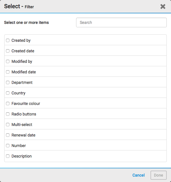
Here you can filter one or more items. Select
Done
once you have selected all the items you want to filter.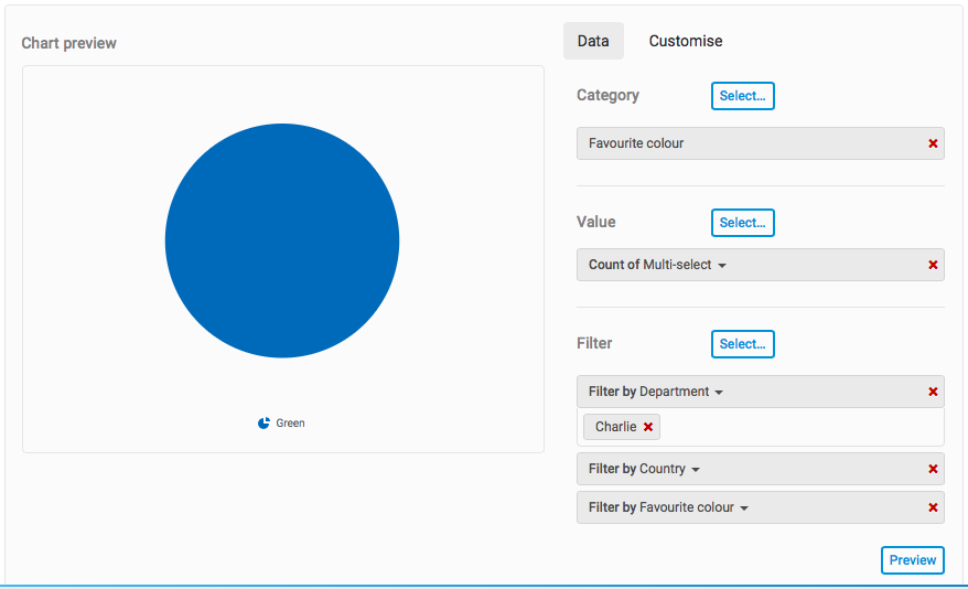
This allows you to further filter your chart results.
note
Date-based charts must not have blank values otherwise date grouping functions will not work. To prevent the error message, modify the
View
to include an 'is not blank' condition for the date column; this excludes records with no date.Calculation error message
There may be an occasion where you come across the following error.
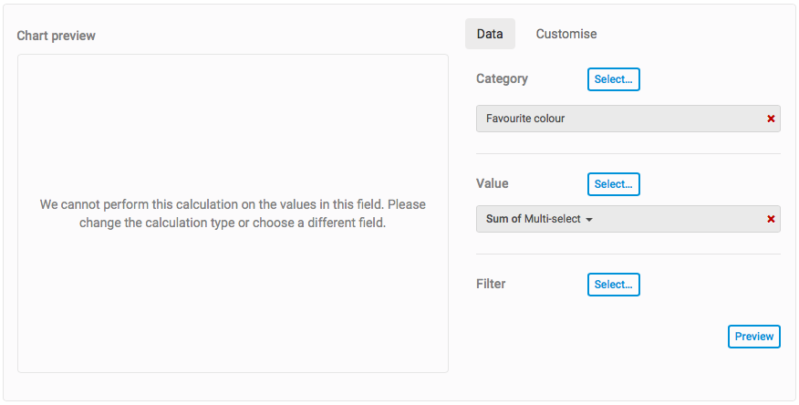
This is most likely because the calculation has been applied as a sum or average, but the values in one of the
Value
columns are not numeric. To fix this issue, either select another column that has a numeric value, or change the calculation type to count.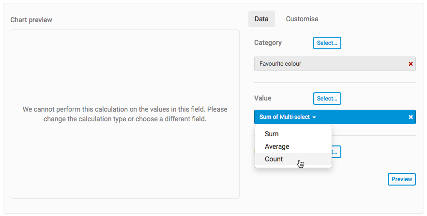
Select
Preview
to refresh the chart and check that the error is resolved.Customise your chart
Once you have selected a category and value for the chart, the
Customise
tab is accessible.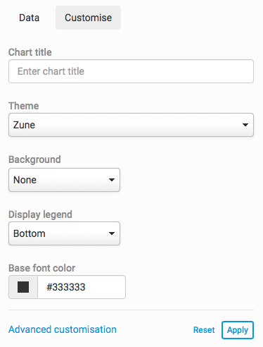
These fields are described in more detail below:
- Chart title- The name displayed on the chart
- Theme- Select a theme for your chart. The theme changes the colours displayed in your chart
- Background- Change the background of your chart. You can either choose a colour or upload an image
- Display legend- Choose if the chart legend is displayed at the bottom of the chart, the right side of the chart or not to display a legend at all
- Base font colour- Select the colour used for the text in the chart
For advanced customisation, select
Advanced customisation
. The Advanced customisation
screen opens.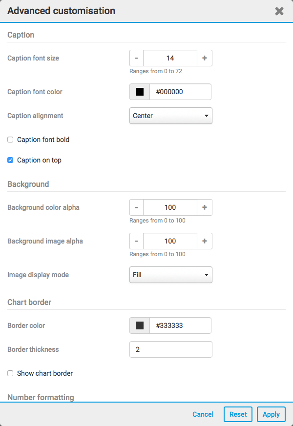
In advanced customisation, you can change settings relating to:
- Caption- Such as caption font size, colour and alignment
- Background- Such as background colour alpha, background image alpha and image display mode.
- Chart border- Such as the border (frame) colour and thickness
- Number formatting- Such as number decimals and prefixes
note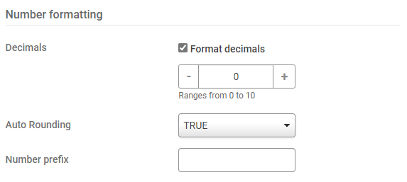
As of November 2023, you can set if numbers greater than 1000 are rounded to the nearest thousand and displayed with a 'K', e.g.12K for 12,250 (the default), or if charts display the full value.
Set
Auto Rounding
to FALSE
to display the full, unrounded value.Thousands separator:
A system admin can request that data visualisation respects the iSheet number format introduced in October 2023. If this is enabled, data visualisation follows the thousands separator defined by the iSheet, not the language set for Collaborate. Please contact your HighQ account representative to request this change.Note: if you use multi-series charts, the format defined in the last value or column defines the thousands separator.
- Data values- Choose whether to show values and also whether you want to show percentage values
- Data label- Choose how data labels are displayed
- Divisional line- Change the appearance of the reference lines across a chart
- Scroll- Choose if it is possible to scroll across a chart
note
Options will differ according to the type of chart.
Select
Apply
to apply your changes.Select
Add
to add your new panel.The panel will be displayed in your new section.
Drilling down to the data
You can click on the information within a data visualisation panel and drill down to the relevant iSheet or Task data. This gives users quick and easy access to the data that drives the data visualisation.
note
It is only possible to drill down into a
User
Lookup column in data visualisation. Other Lookup columns do not support drill-down features.No start date / No due date
Please note that it is not possible to drill down into the ' No start date' and 'No due date' values in task metadata charts based on date values. These represent 'blanks' in the data, and at present charts cannot drill down into blank values.
However, you can select 'No start date / No due date' as a filter, but it will not be shown in the chart itself. In this case, the chart cannot be drilled down, because all of the values are 'blanks'.
If the No start date / no due date is one of many filters, then the chart can be clicked to drill down, but only those values that are not blanks will be shown.
For example, if we have 10 records, 5 with No start date and 5 with a start date, then we click on the chart to drill down, only 5 records will be shown in the drill down.
Finally, please be aware that mixing No start date / No due date filters with other filters in this way is discouraged, as it means the drill-down values will not match the total in the chart, as the blank values are not included.
When viewing a data visualisation panel, when you hover over pieces of data, the cursor will change - showing you that you can now click on that data.
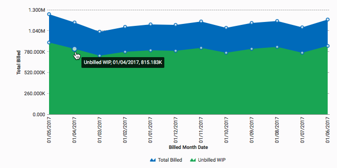
Click on the data you want to view and it will take you to the iSheet or Task, displaying the data.
note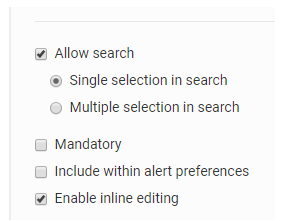
The iSheet column must have the
Allow search
checkbox selected, to drill down in the chart.Multi-engine visualisation
Data Visualisation supports multi-engines. This includes:
- Removal of the selection of 'Category' and replaced it with 'Analysis engine' - this distinction has been made as you will select the category later in the process
- All of the data visualisation charts are now available
- The AI Hub will provide a list of all Category, Series and Value fields based on the selected engine fields in the Hub database
- The Value will be a single select field, not a multi-select field
- Once you have selected a Category and Value you can preview the chart. If you change the selection, the Preview button will be enabled and if pressed, the chart will refresh with the new values. Additionally, you can optionally select a Series (single select) or a Filter (single select). You must also select a suitable Aggregation to perform on the Value. For numbers, this will be a default of Sum and for all other values this will default to Count. Finally, if the column type is unknown, it will default to Count.
- The ability to create charts from the Tasks module source.
- The ability to perform Sum, Average and Count calculations on values
- The ability to filter values displayed in charts and select a series for charts
Customise the value font colour and size
You can customise the
Value font colour
and the Value font size
. This is found in the advanced customisation section.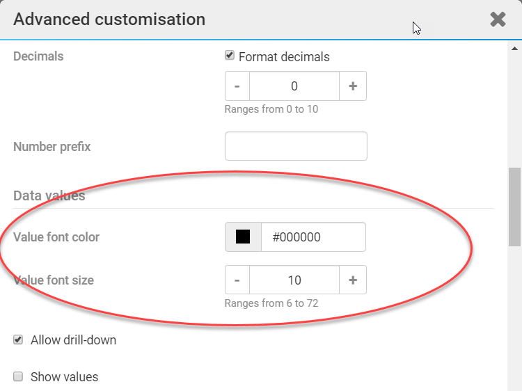
You can also select to show the data values, by selecting the
Show values
checkbox, or hide the data values, by de-selecting the Show values
checkbox.note
This customisation is not available for visualisations that use pie charts.
Chart background colour
The background of all new charts is clear by default. This means that the background colour alpha in the settings have a value of 0 by default, you can change this in
Advanced customisation
> Background
> Background colour alpha
.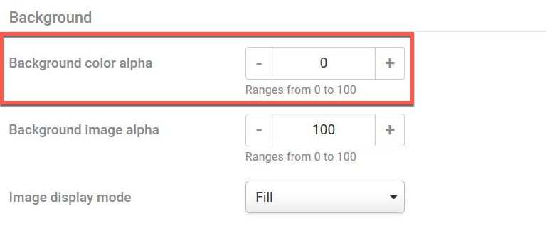
If you select
None
, the default for the background, the background is transparent.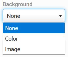
Chart sorting preferences
Custom sorting
(external video link)Please note that as of our Feb 2024 release, administrators have the ability to define chart sorting preferences during the chart setup process, rather than being reliant on iSheet views for sorting.
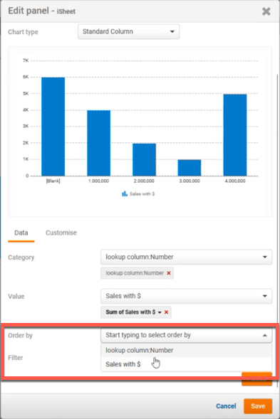
The order by value must be a value already available in the chart for the category or value column, and it will be in Ascending Order. Should you wish to revert this to the previous sort order (based on the iSheet view), please contact HighQ Support.
note
Please note that this feature is disabled by default.
To enable this feature please contact your HighQ support representative to activate.