
Editing a System Dashboard
Once you have created, permissioned and configured your System Dashboards and added them to the Global navigation, you can now safely
Edit
your new System dashboard. note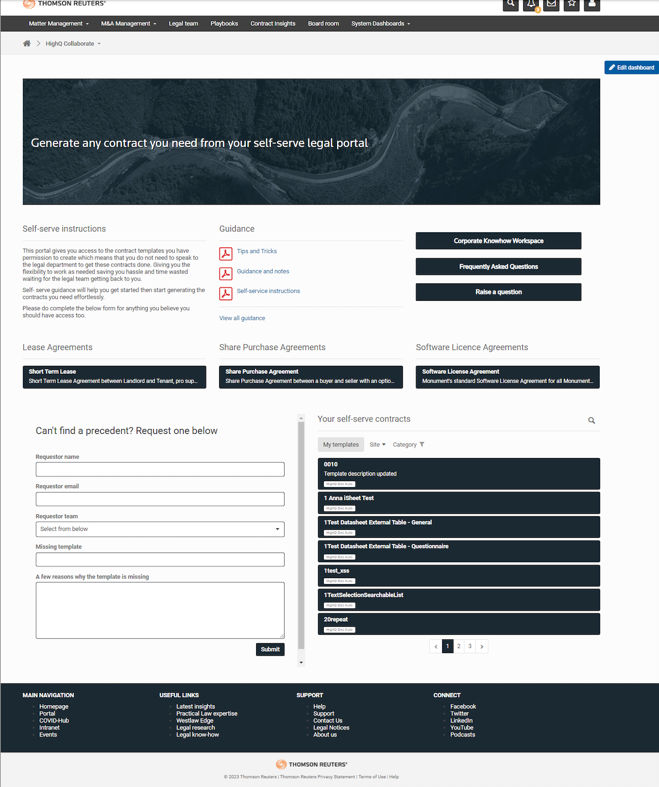
The edit dashboard has been made more visible for editors to make changes once content has been added to the screen.
Please note that on smaller screens it will overlay at the top and move down when scrolling.
To accommodate this change there is a small amount of white space at the top of the screen, however, it is important to note that this is only visible if the user is a dashboard editor. Regular users will not be able to see this space.
As of our April 2024 release, we are adding the systemDashboardID as classes in the CSS body, allowing for more targeted styling and ensuring that your custom styles are applied precisely to the intended pages or dashboards. This level of specificity prevents styling conflicts and enables a tailored visual experience across your site and its various components.
As of our October 2023 release, we have introduced 'lazy loading', meaning additional content will be loaded as you navigate. This means you won't have to sit and wait for all content to load, but the content will progressively load as you scroll. Leading to faster loading times and improved efficiency.
Add sections
Navigate to your newly created system dashboard.
Click
Edit dashboard
to edit the dashboard and select the Add section
button.
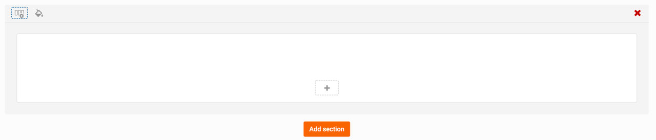
A new section appears on the dashboard.
note
Please note that you can give your dashboard a title in the
Enter dashboard title
section. If the Enter dashboard title
section is not visible, navigate to the dashboard management screen and select the checkbox to enable this section.note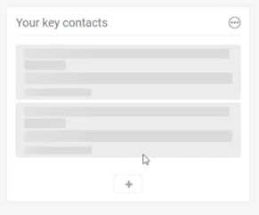
Please note that as of our March 2023 release, we have introduced 'skeleton loading' to our panels.
This shows users that the panel is loading and that their action is currently underway. This removes any doubt as to whether the action has been initiated or not.
Click
Add panel
to add a panel.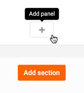
The
Add panel
screen opens.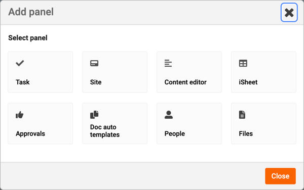
Here, you can select panels to add to your dashboard.
note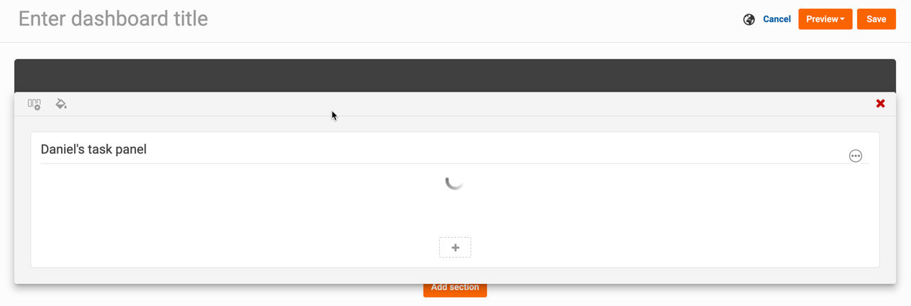
Please note that once you have added several sections, you can drag and drop them to manage the order they are displayed.
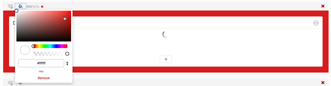
Additionally, you can change the colour of a section's background, via the
Background colour
option.Panels
While building your dashboard, you can add several panels. The panels available are:
note
Please note that the data visualisation panel you may be familiar with has been split into a tasks panel (when only one task is selected) and an iSheets panel (when an iSheet is selected). Currently, custom themes of data visualisation are not available, but will be in a future release.
With version 5.9.8, we've updated the panel styles to achieve a modern aesthetic and enhance the visual appeal of the user experience. This builds on the release of version 5.9.0, which introduced avatars and panel borders.

note
While we haven't modified most of the underlying code (except for pagination), we have made CSS changes that may affect custom code on system dashboards. Please review these changes to identify any potential impacts.
Edit a Header section
Header sections allow administrators to add a header image to the top of a Custom Page, enabling visual branding without any coding or custom CSS.
note
Header images must be in JPEG or PNG format, with a maximum file size of 5 MB. Accepted dimensions range from 800–1920 pixels in width and 100–600 pixels in height; images outside these limits cannot be uploaded.
Adding a Header Image
- Open the Custom Page in Edit mode.
- Select the Header section and choose the option to upload an image.
- Upload a JPEG or PNG image that meets the supported size and dimension requirements.
- Once uploaded successfully, a preview of the image is displayed in the Edit header section modal.

Display Options
After uploading an image, you can choose how to display it with several available options.
- Original width- Displays the image at its original uploaded width. The image appears at the top of the header section without stretching.
- Extended width- Stretches the image across the full available width of the browser window. The image dynamically resizes as users resize or zoom their browser window. This option extends beyond the Custom Page content area to the full Collaborate view.
- Trim to content width- Trims the image to fit exactly within the Custom Page content width. Useful when an image is wider than the content area but should not stretch across the full browser width.
The
Display in
control allows administrators to determine which device categories will show the header image: - All devices (default)
- Desktop and tablet only
This allows large header images to be hidden from mobile devices where screen space may be limited.
Select
Done
to close the configuration, then save
the page to apply changes. Once saved, the header image will be visible to end users with panels overlaid.
Custom KPI Border Color Options
Users can now customise the KPI border color for a more distinct or stylish appearance that provides the flexibility to override the white default border color and define their preferred style.
To apply KPI changes, navigate to
system admin
> customize
> KPI card default border color
under the general section.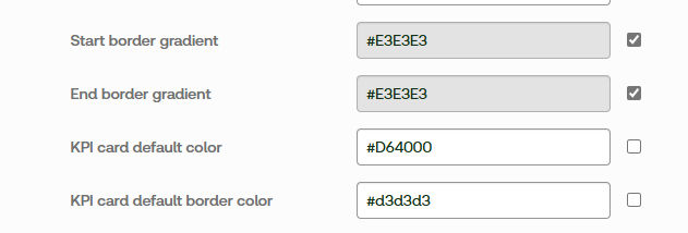
note
For existing clients, the KPI card border will default to the same color as the KPI card.